kuniga.me > NP-Incompleteness > CSS Layout
CSS Layout
20 Jan 2018
Introduction
In a previous post we studied some major components of the browser, including the rendering engine. In this post we’ll dig a bit further on the layout of the render tree and take a look at an important piece of this process: the cascading style sheets or CSS.
To recap, every DOM element is usually represented by one rectangle. The job of the rendering engine is to determine two properties of these rectangles: their size (height, width), position (top, left) and stacking order when they overlap. In this post we’ll see how different CSS properties can affect the resulting rectangle.
Note: we’ll use box and rectangle interchangeably in this post.
CSS
History

CSS stands for cascading style sheets. It was proposed by Håkon Wium Lie in 1994.
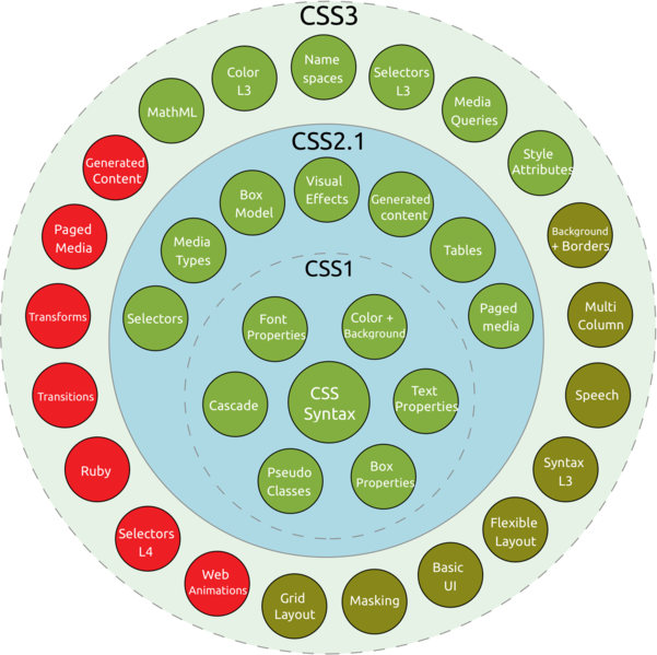
The CSS 1 specification was finished in 1996. CSS 2 was created to address some issues with the previous version in 1997. CSS 3 was started in 1998 but hasn’t been concluded yet! The thing is that CSS 3 is subdivided in modules and each is fairly independent of each other, which resulted in different modules having different phases.
The diagram below provides a good overview on the different modules from CSS and their stage:
Wikipedia has an interesting history of the development of CSS, including the initial lack of compliance to the specification which caused a lot of headaches to front-end developers, especially when working with early versions of the Internet Explorer.
It’s interesting to take a look at the early days of CSS because it plays a big role in how it looks today (due to back-compatibility). It’s useful to remember that back in the days when CSS first came around, web pages were generally pure HTML containing mostly text, so a lot of CSS was designed around concepts such as paragraphs and simple images.
In this post we’ll focus on the CSS modules that affect the layout of the DOM elements, in particular the Visual formatting model. According to the spec, these are factors that influence the layout of a box:
- Box dimensions (
heightandwidthproperties) - Type of box (
displayproperty) - Positional schemes (
position,leftandtopproperties) - Relationship between elements (hierarchy of DOM tree)
- External information (e.g. window size)
We’ll briefly cover some of these properties and then play with a few examples.
The display property
There are many possible values for the display property. The main ones are none, block, inline and inline-block. I’ve been using flex increasingly but that deserves a post in itself (this article is a great reference).
Display none removes the element from the layout calculation so it’s effectively invisible.
A value of block causes the element to be visually formatted as a block [5] (other values like list-item and table do to). In general a block is a box that starts at a new line and takes the entire width of the parent.
An inline box on the other hand starts from the left of the previous box. It also ignores explicit width and height values and any explicit vertical spacing (i.e.
top/bottom of margin/padding).
The main difference between inline and inline-box is that the latter does account for width and height, and vertical spacing [6].
The position property
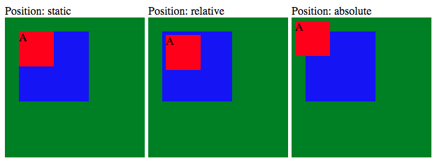
There are 5 possible values for the position property: static, relative, absolute, fixed, sticky.
static is the default positioning schema and it follows the normal positioning flow of the page.
A relative positioned element accounts for top and left properties. These are in relation to the parent.
An absolute positioned element is similar to a relative, except that it is removed from the normal layout flow (i.e. other elements ignore its existence when being positioned) and its top and left are in relation to the first positioned ancestor in the DOM tree (or the document if none is). A positioned element is any with position != static.
Here is an example where we only change the inner (red) div to static, relative and absolute, respectively.
Position: static

<div class="green box200">
  <div class="blue box100" style="position: static">A</div>
</div>

Position: relative

<div class="green box200">
  <div class="blue box100" style="position: relative">B</div>
</div>

Position: absolute

<div class="green box200" style="position: relative">
  <div class="blue box100" style="position: absolute;">
    <div class="red box50" style="position: absolute;">C</div>
  </div>
</div>
.box100 {
width: 100px;
height: 100px;
top: 5px;
left: 5px;
}
.box200 {
width: 200px;
height: 200px;
}
.box50 {
width: 50px;
height: 50px;
top: 15px;
left: 15px;
}In the first example, A ignores the top/left properties. In the third example is “crosses” the boundary of the middle (blue) box because it’s not positioned.
Note that in the code above we have set overflow to auto. This is a hack to prevent margin-collapsing.
An element with position:fixed is similar to position:absolute, except that instead of having its offset relative to an ancestor with position:relative, usually it’s relative to the viewport. That implies that such element scrolls with the page. The special case happens when one of its ancestors has transform, perspective, or filter set to something other than none, in which case it behaves much like an absolute positioned element.
Finally, as described in [2] an element with position:sticky is treated as relatively positioned until it crosses a specified threshold, at which point it is treated as fixed until it reaches the boundary of its parent.
The float property
When a element is floated, it is taken out of the normal layout flow of the document. It is shifted to the left (assuming a float:left) until it touches the edge of its containing box, or another floated element.
Because float implies the use of the block layout, it modifies the computed value of most of the display values to block.
Floats are better understood in relationship with other types of boxes. Let’s check some examples.
Float + Block
Whether the renderer accounts for a floated element when positioning a new block depends on the block formatting context. For example:
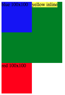
<div>
  <div class="box blue" style="float:left">blue 100x100</div>
  <div class="green" style="height: 200px; width:200px">
    <span class="yellow">yellow inline</span>
  </div>
  <div class="box red">red 100x100</div>
</div>
The green block ignores the presence of the blue block but its child (yellow) does not. That’s because blue and yellow are in different block formatting contexts.
Float + Inline
Analogous to a block context, an inline formatting context is a set of inline elements. In such context, the boxes are laid out horizontally. Each “row” of inline elements is called a line box. In the presence of floats, the spec states the following:
In general, the left edge of a line box touches the left edge of its containing block and the right edge touches the right edge of its containing block. However, floating boxes may come between the containing block edge and the line box edge. Thus, although line boxes in the same inline formatting context generally have the same width (that of the containing block), they may vary in width if available horizontal space is reduced due to floats. We can see an example of that in here. In this example the first three line boxes have a shorter width than the fourth one due to the presence of the float element.
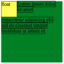
<div class="box200 green">
  <span>Lorem ipsum dolor</span>
  <span class="yellow box50" style="float:left">float</span>
  <span>sit amet</span>
  <span>consectetur adipiscing elit</span>
  <span>sed do eiusmod tempor</span>
  <span>incididunt ut labore et</span>
</div>
span {
word-break: keep-all;
white-space: nowrap;
border: 1px solid;
}Clear
When applied to a floating element, clear moves the margin edge of the element below the margin edge of all relevant floats (depending on whether it’s clear left, right or both). Here’s an example:
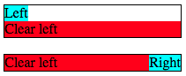
<div style="width: 200px; background-color: green">
  <div class="red" style="clear:left">Clear left</div>
  <div class="blue" style="float: left">Left</div>
  <div class="yellow" style="float: right">Right</div>
    <div class="blue" style="float: left">Left</div>
  <div class="red" style="clear:right">Clear right</div>
  <div class="yellow" style="float: right">Right</div>
</div>
The z-index property
Besides determining the size and position of boxes, the layout engine needs to determine how to handle overlapping. The boxes ordering is transitive, meaning that if a box A is under B, and B is under C, A has to be under C.
The main attribute to control the stack order of elements is the z-index property (in reference of the z-axis, commonly used as the “depth” dimension in 3D). But this number only applies for boxes under the same class. As we’ll see now, it’s more complicated than it seems.
First, we need to define the concept of stacking context. A stacking context encompasses a set of DOM elements which can be compared to each other. The order of the stack context always take precedence over individual orders of elements within a stack context. For example, imagine that we have 2 stacking contexts:
Stack context 1: [A -> B -> C -> D]
Stack context 2: [E -> F -> G]
Stack context 1 -> Stack context 2
The arrow (->) represents that the element on the left is on top of the element on the right. Because A, B, C and D belong to context 1, all of them are placed over E, F and G, no matter how big the z-index of elements in the second group are.
Another way to see it is that a stacking context defines an “atomic position”, meaning that elements from outside it cannot be placed in between its elements. It has to be either above or below.
In the DOM tree, if a node E satisfies some conditions, it starts a new stack context, which means that all elements in the DOM subtree of that element will be under that stack context (we say E is the root of such stacking context). Note that a stack context can contain other stack contexts. A few properties that cause a stacking context to be formed are:
- position:
absoluteorrelativeand z-index other than auto - position:
fixedorsticky opacityless than 1.- others
Note that position: static ignores z-indexes, so a corollary is that the use of z-index effectively creates a new stacking context.
Within a stacking context, the order of elements is defined by the spec. Here’s a simplified version, from bottom to top:
- The background and borders of the element forming the stacking context;
- Stacking contexts with negative z-indexes;
- Non-positioned block boxes;
- Non-positioned floats;
- Non-positioned inlined boxes;
- Stacking contexts with positive z-indexes;
Another corollary is that a parent is always rendered below its children due to the first rule above.
Here is an example with elements of each of these categories.
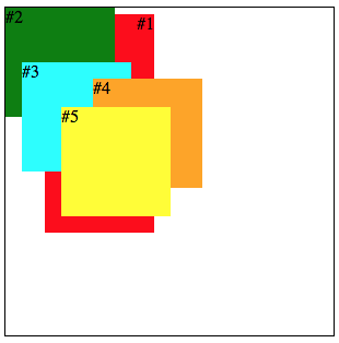
<div class="root_stacking_context">
  <div class="box stack_context_negative_index">#1</div>
  <div class="box non_positioned non_inline">#2</div>
  <div class="box non_positioned_float">#3</div>
  <div class="box non_positioned inline">#4</div>
  <div class="box stack_context_positive_index">#5</div>
</div>
.box {
height: 100px;
width: 100px;
}
.root_stacking_context {
border: 1px solid;
height: 300px;
width: 300px;
}
.stack_context_negative_index {
z-index: -1;
background-color: red;
height: 200px;
position: absolute;
text-align: right;
top: 15px;
left: 45px;
}
.non_positioned.non_inline {
background-color: green;
top: 30px;
left: 30px;
margin-bottom: -50px;
}
.non_positioned_float {
float: left;
background-color: cyan;
margin-left: 15px;
}
.non_positioned.inline {
background-color: orange;
display: inline-block;
margin-left: -35px;
margin-top: 15px;
}
.stack_context_positive_index {
z-index: 1;
background-color: yellow;
position: absolute;
top: 100px;
left: 60px;
}Here is an interesting example with stacking contexts.
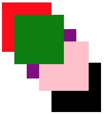
<div class="box red">
  <div class="box green" style="margin: 25px; z-index: 11" />
</div>
<div
  class="box purple"
   style="margin-top: -100px; margin-left: 50px; z-index: 10">
  <div class="box pink" style="margin: 25px; z-index: 9999" />
</div>
<div
  class="box black"
  style="margin-top: -100px; margin-left: 50px; z-index: 9"
/>
The red box is the parent, so it has to be under the green box. The green, purple and black boxes are in the same stacking-context so they are ordered based on the z-indexes (since red doesn’t start a stack context, green belongs to the top-level stack context). Finally, note how pink has the highest z-index, but is still placed under green because it belongs to the stack context of purple, which is placed under green.
References
- [1] MDN Web Docs: CSS display
- [2] MDN Web Docs: CSS Position
- [3] MDN Web Docs: CSS Float
- [4] A Complete Guide to Flexbox
- [5] MDN Web Docs: Block formatting context
- [6] StackOverflow: display: inline vs inline-block
- [7] All about floats
- [8] CSS 2.1 Specification: Visual formatting model
Conclusion
My main goal with this study was to learn more about the layout algorithm used by render engines but this turned out to be an analysis of some CSS properties. It was an interesting exercise anyway. I work with CSS on a daily basis but often times I don’t take the time to read the spec or understanding why a given set of properties behave in a certain way.
