kuniga.me > NP-Incompleteness > OpenVis Conf 2017
OpenVis Conf 2017
01 May 2017
I attended the OpenVis Conf in Boston. It’s a broad Data Visualization single-track 2-day conference with an industry focus. Here are my notes on the talks.

Mike Bostock’s Keynote
Mike Bostock (the famous creator of D3.js) opened up the conference by talking mainly about d3.express, a new library he’s working on. Despite the name, it has no dependency on D3 itself, but rather, it looks more like Python/R notebooks in which you can write JavaScript expressions in a console-like environment, but that get re-evaluated as you change upstream assignments. It borrows a lot of ideas from Reactive programming, in particular Bret Victor’s ideas (this paradigm immediately reminded me of his Ladder of Abstraction).
Another interesting feature of this library is the built-in animation loop functionality. Through a slight modification of the ES6 syntax, Bostock uses generators as a simple construct to express animations. The library also include helpers to easliy build common UI input controls, such as a scroller and checkboxes.
d3.express is currently in development, not yet ready for use.
Data Sketch|es: a visualization a month

Shirley Wu and Nadieh Brehmer presented the lessons learned during their (ongoing) project called Data Sketch|ES, which consists in crafting a Data Visualization a month. A technique adopted by creative artists, this constraint is both the challenge of coming up with original ideas but also getting them done in a predicted amount of time.
Some of their lessons included cross-checking the data – even if obtained from usually reliable sources, iterate between sketches on paper and actual code prototypes – it’s hard to predict how a visualization will look like, especially if interactive, delight the audience – spending time polishing the work and making use of animation to keep users interested and engaged.
Visualizing data with Deck.gl
Nicolas Belmonte is the head of the Data Visualization at Uber. They’ve open sourced Deck.gl a library on top of WebGL, used to display data overlaid in a map. It has good integration with React and Mapbox GL. They showcased a really awesome application simulating wind patterns using particles based on a wind vector map.

What Store Does Your Timeline Tell?
Matthew Bremer is a researcher at Microsoft and he explored many unconventional ways to represent temporal data besides the regular line chart. He showed some cases with radial axis (daily routine, lifetimes), spiral (cycles), grid. He and other folks wrote a paper on this topic and they have a page with more information.

GDAL
Robert Simmon explained how to use GDAL, a library to work with Geo Spatial data, mostly through command line. Too technical and too specific in domain for me. I didn’t get much from this talk, besides satellite imagery requiring a lot of post-processing to look presentable.
How Spatial Polygons Shape our World
Amelia McNamara discussed representation of quantities in maps, mainly through polygons. These polygons can be arbitrary shapes on the map, but are often represented by district areas, counties, and states.
She first presented a few examples including Choropleth US map and how big sparse states are over-represented while densely-populated small states are under-represented. Some strategies like distorted maps and unit-area maps (like the NPR’s hexmap, which we posted about) can be used with the downside of familiarity or incorrect adjacency of states.
She discussed scenarios in which data from different aggregation levels must be combined, say, one data has county level aggregation, the other has state level aggregation.
Up-scaling is easy. For the county to state aggregation, it might be a matter of just summing values. Down-scaling requires some other external reference, for example, if we can assume the count for a state is a relatively uniform function of the population, we can break it down by county based on their relative population. Side-scaling is harder, especially when one of the polygons is not contained in the other (which was the case for up and down scaling).
Introducing REGL
Mikola Lysenko is the author of the REGL library (which is an evolution of Stack.gl), which provides a functional (stateless) API on top of WebGL, much in line with the paradigm adopted by d3.express from Bostock’s talk. He then proceed to perform a quick live demo demonstrating the expressiveness (and his proficiency), by displaying a 3D scan dataset in a browser. This was by far the most visually appealing talk, with 3D bouncing rainbow bunnies.
Untangling the hairball
John Gomez started with a problem: how to display network data in a meaningful and consumable way. He explored different strategies like limiting the number of nodes to show, clustering, only show edges on hover. It was interesting to learn the steps of crafting a visualization from scratch. He used mostly D3 and developed some modules of his own. Very funny talk.
Designing Visualization Tools for Learners
Catherine D’Ignazio and Rahul Bhargava are interested in tools for people who do not have a analytical background or are not data savvy. Developing tools with this mindset automatically makes tools more accessible for everyone. They presented 4 traits that a good tool must have: focused, guided, inviting and expandable.
A focused tool must do one thing and do it very well (UNIX philosophy). Tableau is an example of a tool that is not focused. It’s not necessarily bad, it’s just overwhelming for a learner. They cited Timeline.js as a focused tool.
A guided tool provides clear affordances on what steps should be taken next. They showcased a tool which starts with a blank canvas where you can add components to it. They provided ways to improve that by starting with a sample component/widget instead of a blank page.
An inviting tool is familiar. It contains examples that users can related to their area/context (journalism, arts, etc). It provides a safe playground for users to try it out, being able to easily undo it and make mistakes. An example of uninviting tool is excel’s pivot table.
An expandable tool allows the learner to take a step further towards mastery. It’s not a rigid static tool. It does not shy away from technical terms because it doesn’t want to be incorrect or misleading, but it provides signifiers such as tooltips. An example of non-expandable tool is a (static) infographic.
Visualizing Incarceration in the US on Polygraph
Matt Daniels provided a set of rich and interactive visualizations to represent data from incarcerations in the US. The project started by looking at a line chart representing the growth of convicts in the US, where a sharp increase in the numbers during the 2000s led to an astonishing 1% of the American male population being behind the bars these days.
His attempts were to gain insights on what measures can be taken to reduce incarcerations, breaking it down by causes, gender and other dimensions. He described the pain in obtaining accurate and detailed data, having to settle for Florida’s data, a state with an unusually transparent criminal system.
It felt that much of the work was yet to be done, so the talk didn’t unleash its full potential.
Amanda Cox’s Keynote
Amanda Cox discussed uncertainty in charts. It’s a challenging component because probability is not intuitive and a lot of people cannot interpret it correctly.
I missed the first half of this talk, so it’s probably not capturing the full context.
A data point walks into a bar: designing data for empathy
Lisa Rost discussed the importance of including the emotional component in the design of the visualization. Rationality is necessary for a informed decision, but emotion is also needed to convince.
She provided 5 strategies that can be used to trigger more emotional response from a user:
- Use colors - explore intensity, an example was the use of bright red to evoke the image of blood in a violent deaths chart
- Show what you’re talking about - instead of plain bar charts, how about a stack of icons representing people if we’re talking about mortality?
- Show what data would mean for the user - create a visualization that will put the viewer as the protagonist. Examples include wording (using “you”), or analogies to more common ground (e.g. for an event that occurred in Syria, use an analogy to what it would look like if it was in the US)
- Zoom into one datapoint - people related more to individuals than groups. Focus on one person’s story.
- Show masses as individuals - masses are impersonal. Instead of communicating totals, use averages to make it more personal. For example: “X people died in the event”, can be rephrased as “1 person died every Y minutes”.
D3 with Canvas
Kai Chang demonstrated how to render D3 charts using Canvas. It was very code-oriented, hence hard to follow, but it was good to learn what can be done. I don’t recall him using any extra library for that.
One interesting trick he shared is how to perform a onClick functionality in a polygon rendered with canvas. For SVG it’s easy, but for Canvas it’s a bitmap, so we’d need to use some sort of point-inside-polygon algorithm. He suggested rendering another polygon underneath with the same shape but with a custom color. Canvas has an API to retrieve that color, so we are able to tell which polygon the click was from, based on the color associated to that polygon.
Pulling a Polygon out of a hat
Noah Veltman had a very interesting talk about animated transitions between polygons. He started with a simple mapping from a square to square, then triangle to square, which require introducing auxiliary points to the triangle so the number of vertices between the polygons match. He generalized to arbitrary (including concave) shapes and compared how much more natural his algorithm looked compared to a naive approach. He finished with a yet-to-explore question: how to map polygons with different topological properties (e.g. a polygon with a hole to a polygon without one). Very entertaining and educative.
Text Mining and Visualization, the tidy way
Julia Silge explained the basics of text mining using unsupervised methods to obtain interesting insights from large bodies of text. She presented a demo using R and ggplot2. The main visualization used were histograms.
Why does Data Vis need a style guide?
Amy Cesal discussed the advantages of a consistent style for visualizations. It must be consistency across an organization, not only software (especially because in many cases multiple tools are used). Color, text (terminology, writing style, tone) and also layout.
Vega-lite: A grammar of interactive graphics
Kanit Wongsuphasawat, Dominik Moritz and Arvind Satyanarayan are students at UW, and have developed a simpler version of Vega, called Vega-Lite. It’s basically a system which translates a JSON configuration into Vega syntax. It relies on convention over configuration to make it very simple to create basic charts but also allows for more powerful visualizations.
A very interesting concept is the multi-chart configuration. Through operators it’s possible to “explode” a single chart into multiple ones (e.g. break down a line chart with multiple lines into multiple charts with its own line), it allows combining different chart types. The most interesting idea in my opinion is being able to use nested configurations to create dashboards. The binary tree hierarchy can be used to define how the widgets are laid out (through horizontal and vertical partitioning). This hierarchy can also be used to define controllers that affect a subtree. For example, if we define a scroller at a given node, it affects all the widgets within that subtree. Voyager is a UI built on top of Vega and looks very similar to Tableau.
Data as a creative constraint
Eric Socolofsky has done some work for the Exploratorium and talked about computer art and how it can be applied to data visualization. He mentioned some components/types of digital art:
- Generative art: computer generated imagery.
- Randomness - for example, to represent uncertainty as mentioned in Amanda Cox’s talk
- Particle systems - for example, the Wind Map presented by Nicolas Belmonte
- Recursion and repetition - fractals
- Motion - animation
- Color
Empowering effective visualization (color) design
Connor Gramazio proposes an algorithm generated palette based on the CIELab color space and defines two metrics: discriminability (being able to tell different colors apart) and preferability (subjective measure of how an user likes the colors in the palette). He performed user studies to compare this palette to other palettes such as colorbrewer and Microsoft’s.
Overall it was very academic and technical and I got lost on the details.
Hacking your health with JavaScript
Alan McLean, talked about his works in Health tracking companies and also analyzing his own health. The tone of the presentation was a bit dark, but it did raised awareness (in the lines of Rost’s empathy talk) of how visualizations can be impersonal and cold, especially when the data displayed is about the user themselves.
The role of visualization in exploratory data analysis
This was basically a quick R tutorial focusing on packages like dplyr and ggplot2. Hadley Wickham performed a live demo to represent data of his github commits and his trips.
Conclusion
Overall the conference was very interesting, with a diverse set of topics. I like that it’s industry driven, that is, not too academic. A lot of the talks are about ad-hoc visualizations, but since I work on developing general-purpose UI data tools, “Designing Visualization Tools for Learners”, “Why does Data Vis need a style guide” and “Vega-lite: A grammar of interactive graphics” were the most applicable to my work.
Uber has an interesting setup. One of the presenters, Nicolas Belmonte, is the head of the Data Visualization at Uber. I’ve talked to one of their teammates during lunch. They’re a horizontal team of around 25 people which embed themselves in different teams to work on specific visualization projects.
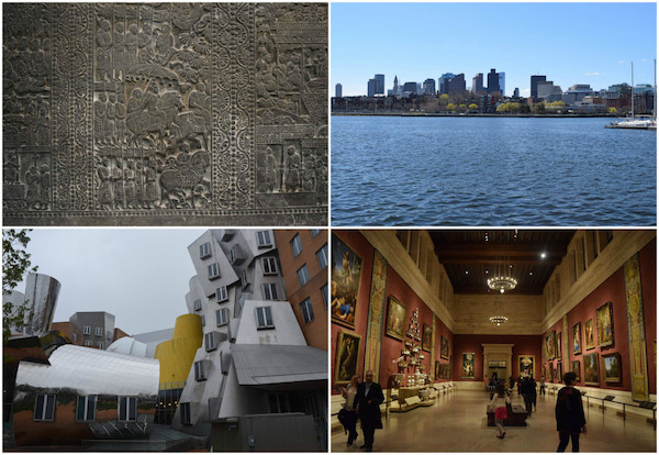
Prior to the conference I took a few days to explore the city, including the nearby Cambridge. I toured around Harvard, MIT, did the Freedom Trail, ate a lot of seafood but the highlight of the trip was the Boston Museum of Fine Arts.