kuniga.me > NP-Incompleteness > [Book] The Design of Everyday Things
[Book] The Design of Everyday Things
06 Sep 2016

Don Norman is the director of The Design Lab at University of California, San Diego.
In The Design of Everyday Things, he discusses human psychology, introduces many concepts around design and provides suggestions to improve the usability of products. He takes into account practical real world challenges, such as time and budgets constraints during development.
The book is divided into seven chapters which we’ll summarize in this short post.
1. The psychopathology of everyday things
This first chapter focus on attributes of products that influence its usability. It introduces concepts such as affordances, mapping and feedback that improve usability. Affordances help people figure out what actions are possible without the need for labels or instructions. These are relationships (between human and object), not (object) properties.

Sometimes it’s not possible to make actions obvious, in which case we need signifiers to help with it. Signifiers include messages, symbols and legends.
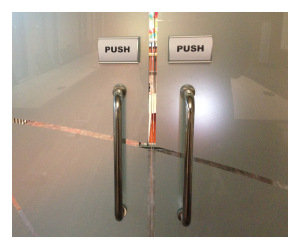
Mapping is useful when the controls the human interacts with are not in the same place as the object controlled. A common example is a switch and light. When there are many lamps to control using physical correspondence between them make it easier to find out which switch controls each light.
My first reaction on the switch above is that it looks ugly and cluttered. One message I got from the book is that good design is not necessarily beautiful and minimal - sometimes they’re conflicting even, because they might hide affordances and signifiers.
Feedback is communicating the result of an action immediately. This includes turning the light on the elevator button when it has been pressed or in web design depressing a button and disabling it temporarily (if the result cannot be returned immediately).
Conceptual model is the ability for the user to keep a simplified version of the system in their mind, often relating to an existing product. One example is the use of terms like Desktop, Folders and Files in the GUI of an operating system, relying on the existing model of organization from an office.
One example of bad conceptual model is the heater/oven regulated by a thermostat. If you want to pre-heat the oven quicker, one natural idea is to put the temperature to the maximum and then lower it down when it’s ready. The problem is that this is not how thermostat ovens work. They have a heater providing a constant flow of heat, and they control the temperature by turning it on and off. The longer you leave it on, the higher the temperature gets, but it make it reach that temperature faster.
2. The psychology of everyday actions
This chapter focus on the user side, more specifically, what goes in their head when interacting with a product. He proposes breaking down an action into stages.

He discusses levels of processing: visceral (instinct), behavioral (habit) and reflective (conscious). In the picture above, the stages are aligned by these levels. Intention and evaluation are both at the conscious level, plan and interpretation at the behavioral, and finally execution and perception are visceral.
Users blame themselves. Humans are usually eager in blaming other people day to day, but when interaction with machines, they often blame themselves, but the confusion is caused by a bad design.
3. Knowledge in the head and in the world
This chapter focuses on how we use knowledge to interact with a product. He categorizes knowledge into two: knowledge in the head (memory) and knowledge in the world (conventions, standards).
Delving into the workings of memory he talks about short term vs long term memory and how short memory can only keep a few item “on cache” (using a computer analogy). The author mentions how constraints help remembering things, such as why it’s easier to remember poems vs. prose, because has a more rigid structure. He brings back ideas from Chapter 1, like conceptual models and mapping, which reduces the amount of things to remember.
Regarding knowledge in the world, a lot of conventions vary according to culture or country (e.g. which side of the road to drive on), which must be taken into account especially when developing systems available internationally.
Systems should rely more on knowledge in the world than in the head. Some systems rely on knowledge in the head on purpose, often for security reasons, for example reliance on passwords.
4. Knowing what to do: constraints, discoverability and feedback
This chapter focuses on how the product can help users to interact with it by limiting the universe of possible actions (constraints), making it easy to discover the right way to use it (discoverability) and providing feedback information along the way to tell users whether they’re using it correctly.
He categorizes constraints into four types: physical, cultural, semantic (derived from the purpose of the action) and logical (for example: there’s only one logical way to perform an action).
For discoverability the author analyzes the design of faucets, which have to make it easy for users to control water flow and temperature.
For feedback, he discusses the pros (does not require focused attention) and cons (annoyance, surrounding noise) of using sound as feedback.
5. Human error? No, bad design
In this chapter, the author focuses on user errors. He categorizes them into slips (execution error) and mistakes (planning error). Slips are easier to detect because they are a deviation of the expected plan, while mistakes might be executing correctly but the wrong plan.
He suggests designing for errors. This includes preventing errors in the first place (constraints), sensibility checks (e.g. input validation), the option to undo actions, make error obvious and easy to correct.
6. Design thinking
This chapter provides a framework for the process of designing. It includes the double diamond: the first diamond tries to find/define the problem, while the second is to find the solution.
The analogy with the diamond shape is that in both phases it starts by expanding the range of ideas and then narrowing down to specific ones. More technically, he defines four phases in each of the diamonds:
- Observation
- Idea generation
- Prototyping
- Testing
Observation requires a deep understanding of a small set of customers (as opposite to other forms of observations such as large-scale general A/B testing).
Idea generation is basically brainstorming. This, with the prototyping and testing should be an interactive process.
In the rest of the chapter the author discusses related topics of designing, how external factors influence the design process (budget and time constraints), the fact that the buyer might not be the end user (e.g. appliances for a rental place) and how making something harder to use might be desirable (such as to improve security and provide access control).
7. Design in the world of business
In this final chapter, the author focus on real world design. Besides the budget and time constraints, one source of bloated design is the featuritis that arises from competition. If the competitor of a product adds a new feature, it has to follow suit and add it too.
Another challenge with design, arises from the fact that people don’t like changes. Improving the design or introducing a new technology sometimes doesn’t take off until much later when people start getting used to it and adopting it. Around this theme, we discusses the tradeoffs of incremental and radical innovations, and argues that both are important for the development of products.
Conclusion
My impressions: I did like that the book uses consistent terminology to explain concepts and that the author provides a lot of examples. I also like the fact that he come up with conceptual models, defining relationships between different concepts, such as the stages of an action.
I didn’t think the book was very organized. He does mention the book doesn’t have to be consumed linearly, but I did feel that the book was a collection of topics around a theme instead of a cohesive text. I’m used to technical books where you look at the table of contents and how the small parts (chapters) usually have well defined boundaries and how they assemble together to form the big picture.
Most of my work consists in developing Web interfaces for people to do their jobs better. Usability is a very important concept in this field, so I’m eager to learn more about this subject.
Thoughts: Usability of code
In light of a recent read, Code Complete 2, I’ve been constantly aware of the usability (readability) of source code. If we think about it, it shares similar challenges with end products and maybe it’s possible to leverage ideas from this book and apply them to coding.
Some analogies: good function names are affordances on how to use a function, sticking to code conventions are a good way to move knowledge from the head to the world (Chapter 3), comments can act as signifiers, invariants and unit-tests can act as constraints that convey the expected behavior of a function. Conceptual models are achieve by using good abstraction that maps intuitively to the business rules the code is aimed to implement.
As emphasized in the book, we write code for people, not for machines, so there’s no reason to not strive to make them as useful as products we interface with every day.
