kuniga.me > NP-Incompleteness > Introduction to d3.js
Introduction to d3.js
25 Aug 2014

Mike Bostok (@mbostock) is a Computer Scientist currently working for the NYTimes. He was a PhD student at Stanford, when, together with professor Jeff Heer and Vadim Ogievetsky, they created D3.js, a framework for creating data visualizations in Javascript.
D3 stands for Data Driven Documents (DDD) and it simplifies the process of building visualizations on top of data, by handling most of the math and boilerplate necessary to generate visual elements.
In this post, we’ll discuss the basic aspects of D3.js, heavily based on the excellent book from Scott Murray, Interactive Data Visualization for the Web. The book is a relatively short and fun read, and it was compiled from a series of tutorials Scott wrote in the past.
Scott’s book is written for non-programmers and part of the book is also introducing web development technologies such as HTML, CSS and, of course, Javascript. In this post we assume our readers already know about them.
Setup
D3.js is an open-source library and it’s available on github. We can clone that repository and use them in our code. The source code is spread out into multiple files in d3/src/ but they are compiled into /d3/d3.js using a node.js module called smash, also by @mbostock.
The basic template for embedding D3 in a web page is by following this template:
<!DOCTYPE html>
<html lang="en">
    <head>
        <meta charset="utf-8">
        <title>D3 Page Template</title>
        <script type="text/javascript" src="d3/d3.js"></script>
    </head>
    <body>
        <script type="text/javascript" src="my_d3_example.js" />
    </body>
</html>
Note the meta tag UTF-8. It’s important because D3 source file uses unicode characters (like the Greek character π). We’ll do all the work in a separate javascript file, say my_d3_example.js.
We can do all the testing using our local host or use jsfiddle.
DOM Manipulation
D3 handles DOM manipulation very neatly. For example, one of the first things we’ll do when writing a D3 code is to select the body of our html page:
d3.select("body");From there we can perform other DOM operations like adding other DOM elements,
d3
  .select("body")
  .append("p")
  .text("Hello World");
The selection uses CSS3 selectors syntax, so we can also select elements by class ".myClassName" or id "#myIDName".
Multi-selection. One key component of D3 expressiveness is batching operations. This saves us from writing for loops and it makes the code more concise. Say we have an HTML body like:
<body>
  <p>Paragraph 1</p>
  <p>Paragraph 2</p>
  <p>Paragraph 3</p>
  <p>Paragraph 4</p>
</body>
We can access all paragraphs by multi-selecting all <p> tags within the body:
d3
  .select("body")
  .selectAll("p")
  .text("Hello World");
This will set all of the contents of the paragraph to “Hello World”. In most of cases we’ll want to define a callback instead of passing a constant string to handle each entry differently. For example, we could do:
var counter = 0;
d3
  .select("body")
  .selectAll("p")
  .text(function() {
      counter += 1;
      return "New paragraph: "+counter;
  });
Observe how it relies a lot on function chaining. For it to work, it depends on the compatibility of the return type and the next method call, so it can be fragile. The API is very well crafted though, and it usually behaves as we’d expect. Moreover, it makes the code much more legible, removing keyword boilerplates and intermediate variables.
Binding data
One of the most import operation in D3 is binding data to DOM elements. This is done via the data() method. For example, we could do:
var dataset = [3, 5, 8, 13];
d3.select("body")
    .selectAll("p")
    .data(dataset)
    .enter()
    .append("p")
    .text(function(value) { return value; });
First, we are selecting all existing p elements, then we’re binding the data. The method enter() contains the rows from data that are not in the current selection. More specifically, say selectAll() returned 2 existing p elements, that is, an array with index 0 and 1. Our data is an array of 4 elements, with index 0 to 3.
D3 will assume that the indexes 0 and 1 are already there, so it’s not binding the values 3 and 5. We have the 8 and 13 values “unbounded”, so it will append one p element for each of these values and set the text.
It’s possible to specify the keys of the entries in data, but the default key is the array index. So let’s create keys for each of our entries:
.data(dataset, function(value){ return "my_key"+value; })Now we can verify all 4 paragraphs are rendered in addition to the 2 existing ones. For more details, see [2].
SVG and Attributes
Let’s create a simple random column chart. We’ll use SVG elements to render the columns. First, we can start creating and set the dimensions of a SVG element using the attr() method:
var width  = 800;
var height = 300;
var svg = d3.select("body").append("svg");
svg
    .attr("width", width)
    .attr("height", height);
Then, we can generate one rect element per entry of our data. In the code below, note how we set attributes in batch, by calling attr() with a list of attribute names and values.
var barWidth = width/dataset.length;
var padding = barWidth/10.0;

svg
    .selectAll("rect")
    .data(dataset)
    .enter()
    .append("rect")
    .attr({
        'x':    function(d, i) {return i*barWidth;},
        'y':    function(d)    {return height - d;},
        width:  barWidth - padding,
        height: function(d)    {return d;},
    })
    .text(function(d) {return d;});
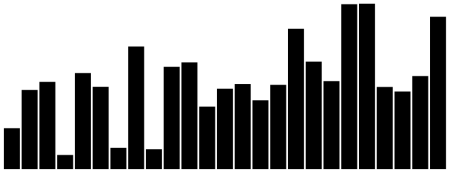
Running the above with 25 random points renders a simple column chart:

Scales and Axis
Scale is essentially a function, that is, it maps a set of input to another output. One example would be if our data had X values ranging from 40-100, but our chart had width 1200px, and we wanted to map the range [40-100] onto [0,1200]. The most natural way to map a continuous interval onto another is through a linear transformation. We could write a function to perform that for us, but D3 makes it very easy to setup such mapping:
var scale = d3
    .scale
    .linear()
    .domain([40, 100])
    .range([0, 1200]);
In this syntax, domain is the input and range is the output.
Scales are important for axis, because axis are essentially visual representations of scales. Creating a simple axis from a scale is simple:
var axis = d3.svg.axis()
    .scale(scale)
    .orient("bottom");

// Append the axis element as an independent element on the svg
svg.append("g")
    .call(axis);
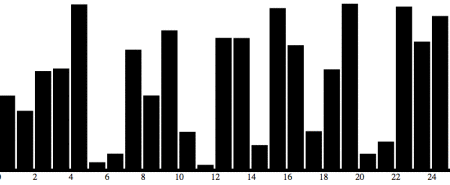
This will place a x-axis at the top of the chart. As we know, the x-axis is commonly positioned at the bottom of the chart, so we need to perform a y-translation of height units.
svg.append("g")
    .attr("transform", "translate(0," + (height) + ")")
    .call(axis);
This will cause the axis to not be shown because it got displaced beyond the SVG element limits. One way around that is to account for an extra height when defining the SVG height:
var width = 800;
var height = 300;
var axisHeight = 20;

var svg = d3.select("body").append("svg");
svg
    .attr("width", width)
    .attr("height", height + axisHeight);
Interactiveness
Another important aspect in data visualization is the interactiveness of the data.
In D3 we can set event listeners on SVG elements through the method on. It takes an event name (examples include “click”, “mouseover”, “mouseout”). A simple example is setting an event listener on the rectangles of our column chart. Let’s color it orange on hover:
svg
    .selectAll("rect")
    .data(dataset)
    .enter()
    .append("rect")
    .attr({
       'x':    function(d, i) {return i*barWidth;},
       'y':    function(d)    {return height - d;},
       width:  barWidth - padding,
       height: function(d)    {return d;},
    })
    .on("mouseover", function (d) { d3.select(this).attr("fill", "orange") })
    .on("mouseout",  function (d) { d3.select(this).attr("fill", "black") })
    .text(function(d) {return d;});
One observation here is that this within the callback function passed to the on method, is bound to the SVG element on which we’re setting up the listener.
The result can be seen on this jsfiddle.
Layouts
Constructing a column/bar chart is relatively straightforward using regular SVG rectangles and the D3 axis helper functions. On the other hand, chart types like pie charts for example, involves working with radians and more complicated math.
To leverage this, D3 uses the concept of layouts. One of the layouts is the pie layout:
var pie = d3.layout.pie();It is basically a function that can transform our regular data into a suitable format for rendering SVG arcs, which will represent the slices of our piechart.
The code below creates binds a generic group element to each element of our dataset. It also translates our pie chart because all values are calculated taking the center of the circle as the origin (0, 0).
var arcs = svg.selectAll("g.arc")
        .data(pie(dataset))
        .enter()
        .append("g")
        .attr("class", "arc")
        .attr("transform", "translate(" + outerRadius + ", " + outerRadius + ")");
Now we can append the actual wedge (represented by the SVG arc element), which can be easily created with the d3.svg.arc() function.
We can use the d3.scale.category10() for generating a set of up to 10 distinct colors for each slice.
var arc =
  d3.svg.arc()
    .innerRadius(innerRadius)
    .outerRadius(outerRadius);

var color = d3.scale.category10();
arcs.append("path")
    .attr("fill", function(d, i) {
        return color(i);
    })
    .attr("stroke", "white")
    .attr("d", arc);
Some magic seems to be going on here. Nowhere we set the start and end angles of our slice. I had to dig into the source code to realize that arc doesn’t represent the actual arc, but an arc generator. Then we set the attribute d, we’re actually calling a function arc() and the data is passed to this function. The startAngle and endAngle properties are being set by the pie layout.
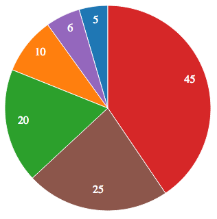
Doing some other tweaks like adding the labels leads to the following pie chart:

Geo-mapping
GeoJSON is a JSON for describing maps in terms of SVG elements. For example, for a US map, each state has it’s own entry in this JSON and they define a set of coordinates that when project become a polygon defining the boundary of the state.
This GeoJSON is usually big, so it makes sense loading them from a file. We can start by doing
var MapsExample = {
    run: function() {
        d3.json(
            "data/us-states.json",
            this.handleGeoJSONLoaded.bind(this)
        );
    },
This file has no actual data, so we need to join with some other file, for example with a CSV file containing state names and some metric, like agricultural productivity (as in Chapter 12 of [1]). So after we have our map info loaded, we can also load the real data:
var MapsExample = {
    ...
    handleGeoJSONLoaded: function(json) {
        this._geoJSON = json;
        d3.csv(
            "data/us-ag-productivity-2004.csv",
            this.handleUSDataLoaded.bind(this)
        );
    },

    handleUSDataLoaded: function(data) {
        this.joinWithData(data);
        this.render();
    },
And before rendering we merge the data into the geoJSON:
var MapsExample = {
    ...
    joinWithData: function(data) {
        // Index geo objects by state name
        geoByState = {};
        this._geoJSON.features.forEach(function(feature) {
            var jsonState = feature.properties.name;
            geoByState[jsonState] = feature;
        });
        // Add the value attribute to the geoJSON
        data.forEach(function(row) {
            var dataState = row.state;
            geoByState[dataState].properties.value = parseFloat(row.value);
        });
    },
Now we’re ready to generate the SVG elements:
var MapsExample = {
    ...
    render: function() {
        var path = d3.geo.path()
            .projection(projection);
        svg.selectAll("path")
            .data(this._geoJSON.features)
            .enter()
            .append("path")
            .attr("d", path)
            .style("fill", function(d) {
                var value = d.properties.value;
                return (value) ? this.color(value) : '#ccc';
            }.bind(this));
The only missing piece here is the color, which maps values from the data into a discrete set of values:
this.color = d3.scale.quantize()
  .range([
    "rgb(237,248,233)",
    "rgb(186,228,179)",
    "rgb(116,196,118)",
    "rgb(49,163,84)",
    "rgb(0,109,44)"
  ])
  .domain([
    d3.min(data, function(d) { return d.value; }),
    d3.max(data, function(d) { return d.value; })
]);
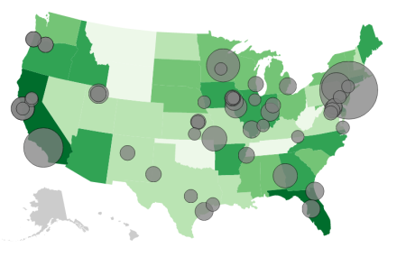
The complete code with additional data added as circles can be seen on github.

Conclusion
D3.js is a very neat library and fun to work with. I’ve learned a lot about D3 and SVG writing this post and also became aware of the effort in standardizing computational cartography (GeoJSON). I’m super excited to try more examples, building stuff on my own and possibly contribute to the project.
My research in grad school was related to proportional symbol maps, and I was surprised that one of the examples consisted in actually constructing a proportional symbol maps with circles.
